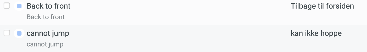
I would like a way to show the context in list view: e.g. right under the phrase to be translated and the translation. Right now it appears to be displaying the key. First a screen shot showing what I’m talking about. Here are two entries from my “base-loom-server” project in list view:
I would like a way to display the context where the gray text is – below each phrase and its translation. I don’t want to edit it, just display it, in the original language.
This would be helpful because it allows a translator to work entirely in list view. One can already edit the translations, which is wonderfully efficient. Showing context adds that useful information right in the list. No need to use the panel to the right (or it can show the file context or screen shots or whatever the translator wants).
Some ideas for how this might work (any of which would make me happy):
Add context (as much as will fit) to the right of the key.
Offer settings to toggle the display of key and context. If both are on, either show both on the same line or have each on its own line.
A setting to toggle the gray text between key and context.
I am very impressed with the list view. It is both efficient and very helpful to see a whole page of phrases and translations at once. This would make it even more efficient.
Thank you for taking the time to write to us with your idea about this improvement! It’s clear you’ve put a lot of thought into this, and we’re genuinely grateful for it.
I have logged your idea and shared it with our product engineering team. We have a dedicated process where our team regularly reviews all customer feedback (internal number 59477).
To be fully transparent, our product roadmap is a complex puzzle, and we have to weigh every new idea against our current priorities. For that reason, I can’t give you a specific timeline or guarantee if or when this feature will be implemented.
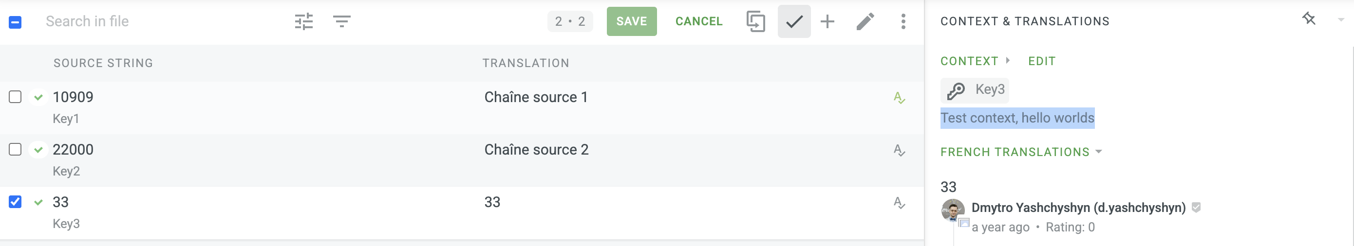
As for now, please refer to the right side of the Editor, where context is displayed:
The development team has reviewed the request, and while they appreciate the idea, they have decided to close this ticket for now.
They did, however, suggest a couple of alternative approaches using existing functionality that could help you:
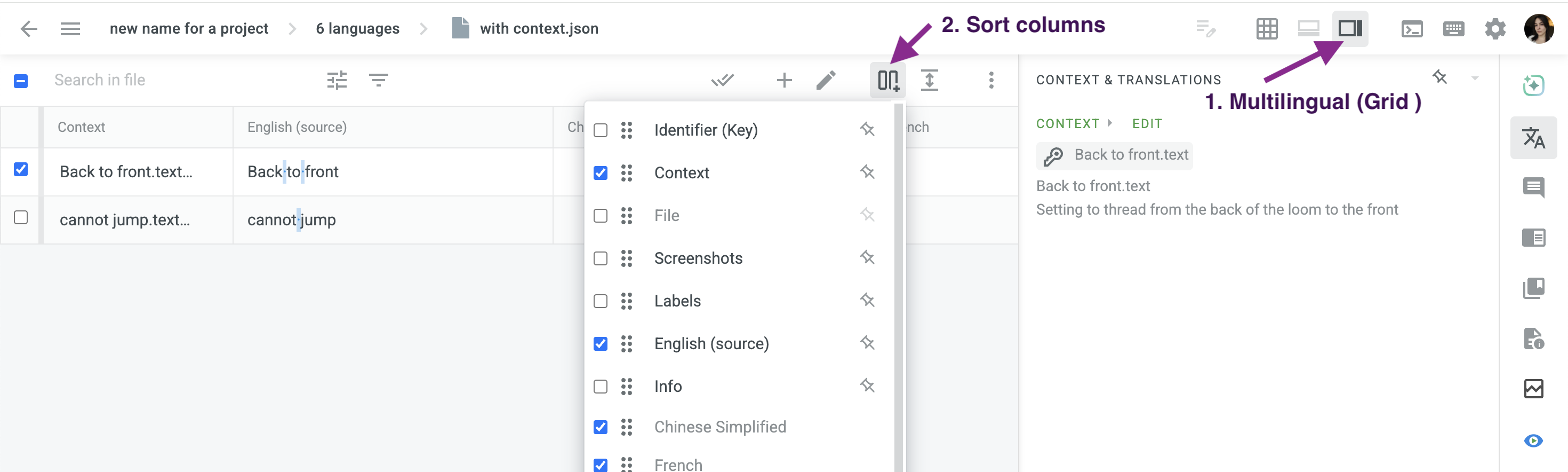
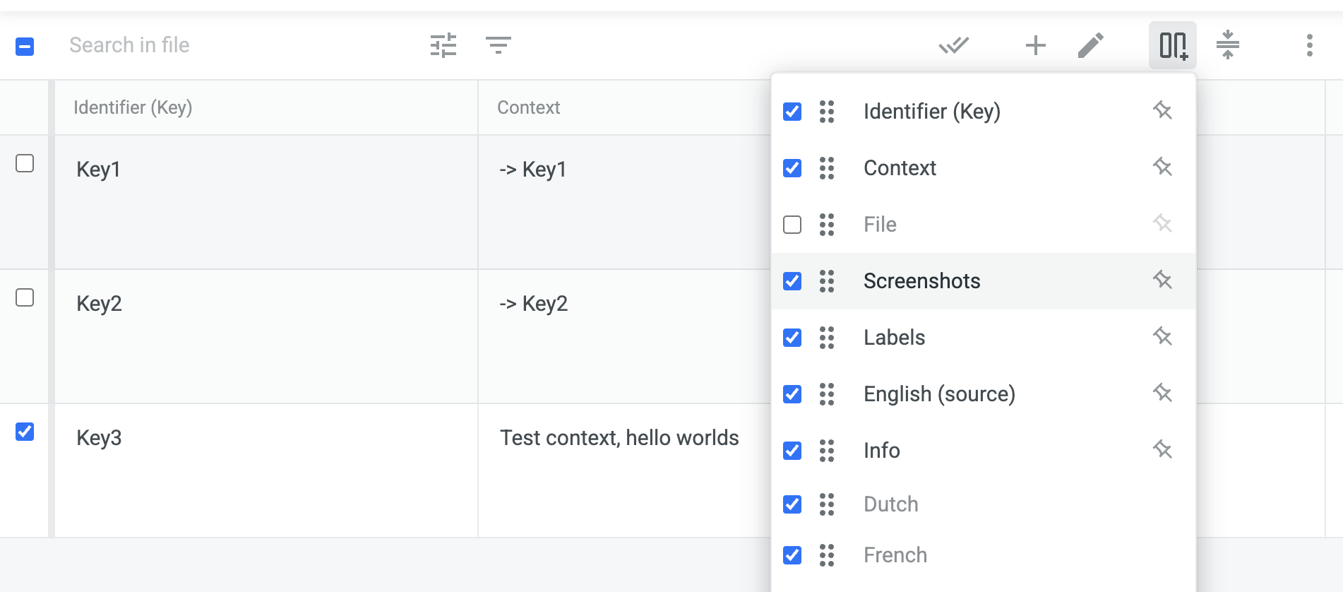
Use Grid View: you can switch to the Multilingual Grid View and configure the columns to show exactly the information you need. This would allow you to display the source phrase, translation, and context side-by-side, achieving the goal of having all necessary information on one screen.
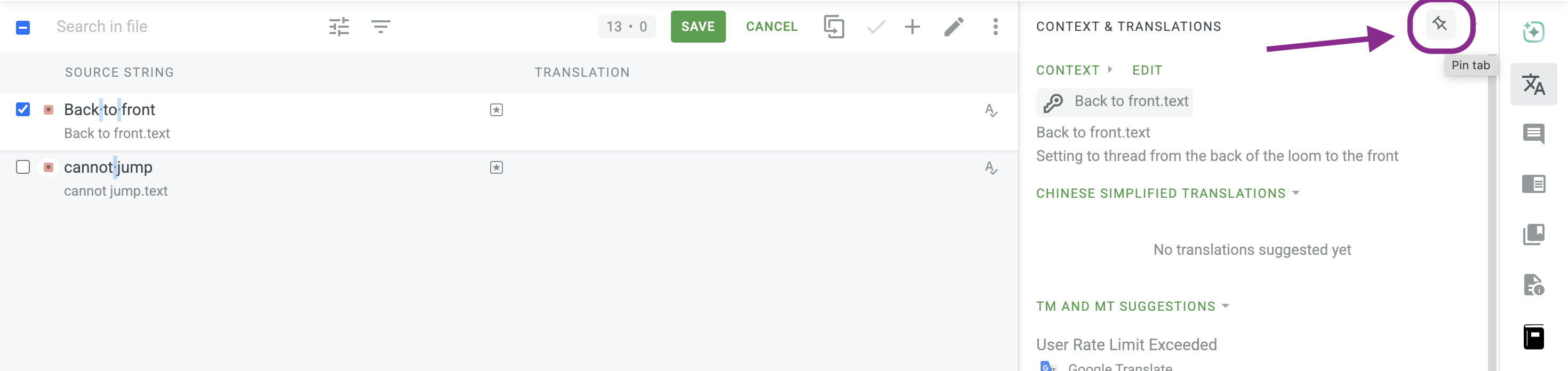
Pin the Context & Translations Tab: another option is to pin the tab in the side panel that shows the context. This will keep the context permanently visible, so you don’t have to click to view it for each entry.
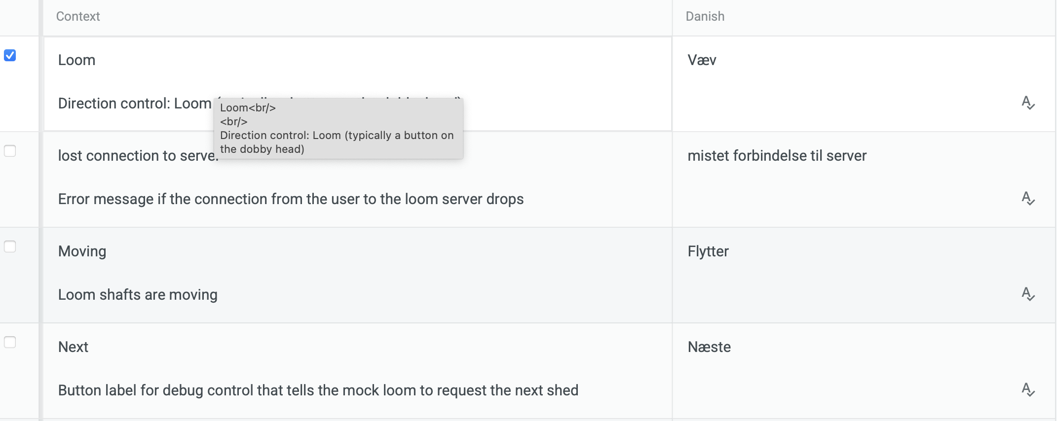
Thank you very much. The grid view is a promising approach. Unfortunately, when I tried it I see both the identifier and the context in the each context cell, separated by a blank line. This wastes an astonishing amount of space: what could be shown in 1-2 pages is shown in 5. Here is a screen shot:
Is this something wrong with my data, or a bug or…?
In any case, I hope the design team will still consider the other approach, since it’s the default view and there’s plenty of room to show the context.